The design process
A timeline of how I got here, how I build a brand guide, and the short list of parts I stopped rebuilding. These are the steps that let me spin up a fully custom site fast, without the mess.
How I got here
Each stop taught me what the next one needed to fix.
- WordPress yearsThemes, plugins, a page builder on top of a page builder.
Every site was a maintenance job. Updates broke things, plugins fought each other, and the attack surface grew with every feature I bolted on. Not to mention the hours sunk into bending it to look the way I wanted without paying for one more plugin.
- The vibe-coder phaseHostinger Horizons, Replit, Lovable: describe the site or app and get one.
A great learning point and my pivot into AI. But the builders lock you into their platform, the plans are ugly, and every site comes out looking like the same SaaS template.
- GitHub + Cloudflare PagesEvery site is a repo. A push is a deploy.
Framework picked per job: Astro for content sites, React where the page is an app, plain HTML when it should just be a file. Brand tokens shared across all of them.
- The labManaging the stack.
Full control of the stack, free Cloudflare Pages, and my own design engine. It's all fun from here.
The brand system
How I build a brand guide.
A brand is one token file. Two colors, the neutrals, a font, and the shades those colors need at other lightnesses. Every site that wears the brand gets a vendored copy from a sync script, and the components only ever say bg-primary or text-accent, never a hex value. Change the orange once, every site follows on the next push.
:root {
  --primary:      211 100% 50%;  /* #007BFF QuickIT blue   */
  --primary-600:  211 100% 43%;  /* hover, same hue darker */
  --accent:        25 100% 50%;  /* #FF6A00 QuickIT orange */
  --accent-400:    25 100% 60%;  /* gradient end           */
  --foreground:     0   0%  7%;  /* body ink               */
  --ink:            0   0% 10%;  /* dark section surface   */
}
/* components never see a hex */
.btn  { background: hsl(var(--primary)); }
.card { background: hsl(var(--primary) / 0.08); }
Bare HSL triples, not hex and not OKLCH, on purpose: hsl(var(--x) / 0.1) is what gives Tailwind opacity for free. The hex lives in the comment so a human can still read it.
| Quick IT Projects | MadeForMeAI | |
|---|---|---|
| primary | #007BFF blue | #1E3A8A navy |
| accent | #FF6A00 orange | #F97316 orange |
| background | white | #FFF7F0 cream |
| dark surface | #1A1A1A | #0A0A0A |
| extras | none | violet + sky for the product UI |
| font | Inter | Inter |
Same markup wearing either file is the whole trick. The style engine runs 32 skins on exactly these tokens.
Patterns I stopped rebuilding
The same pieces, every time.
After enough sites the parts repeat. These are templates now, and a new site is mostly wiring them to a brand.
- Navigation with a single CTA
- Intake and contact forms wired to n8n
- Docs portals (Mintlify)
- Auth behind Authentik
- Dashboards and status pages
- Scheduling (cal.com)
- Chat widgets
- Lead-capture landing pages
- Brand tokens synced into every repo
- Public site, private vault, one database
The ones that lost
One site, six ways
The Quick IT homepage, September 2026. I asked for four full alternatives, picked one, borrowed from another, and shipped. The rejects stay in the repo so I remember why.
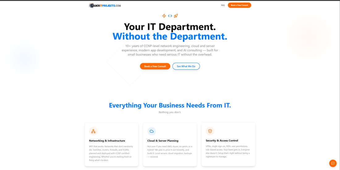
Nine equal service cards, blue and orange fighting for the eye. Fine. Not great.
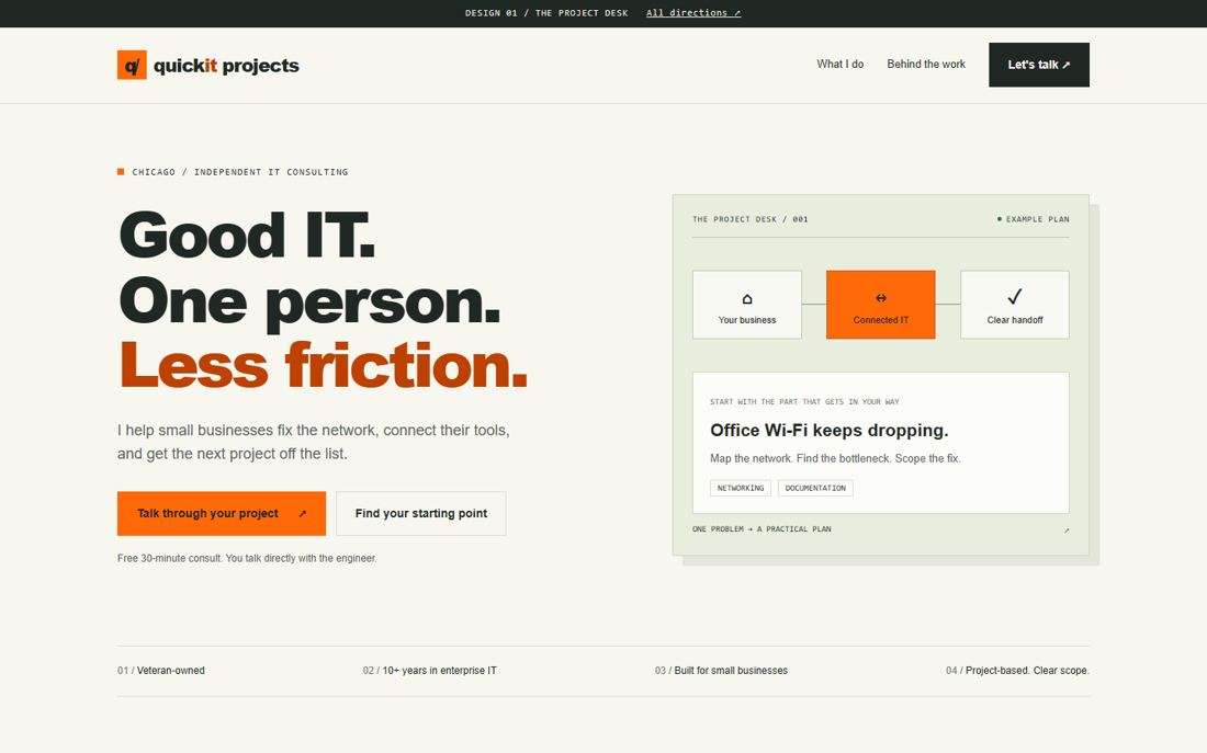
Three starting problems ahead of the catalog, the owner up front. The base for what shipped.
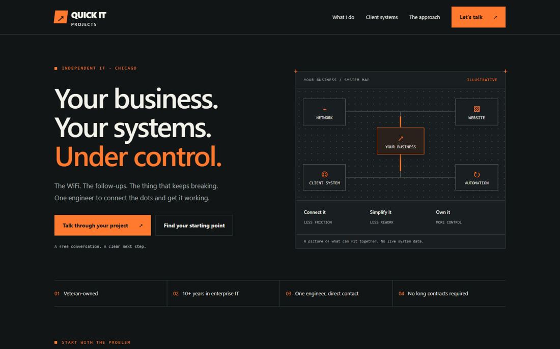
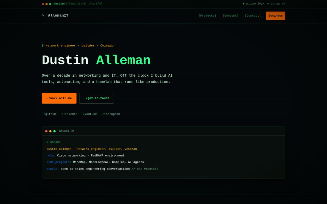
Dark, technical, dense. Right for a tooling page, wrong for a small-business front door.
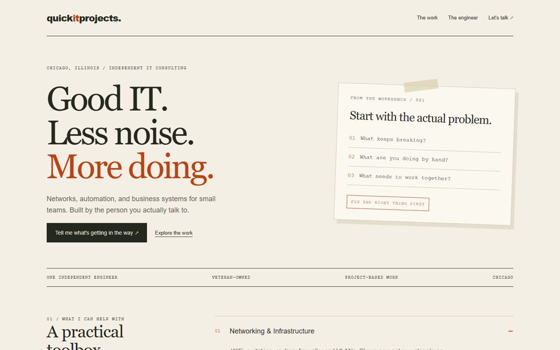
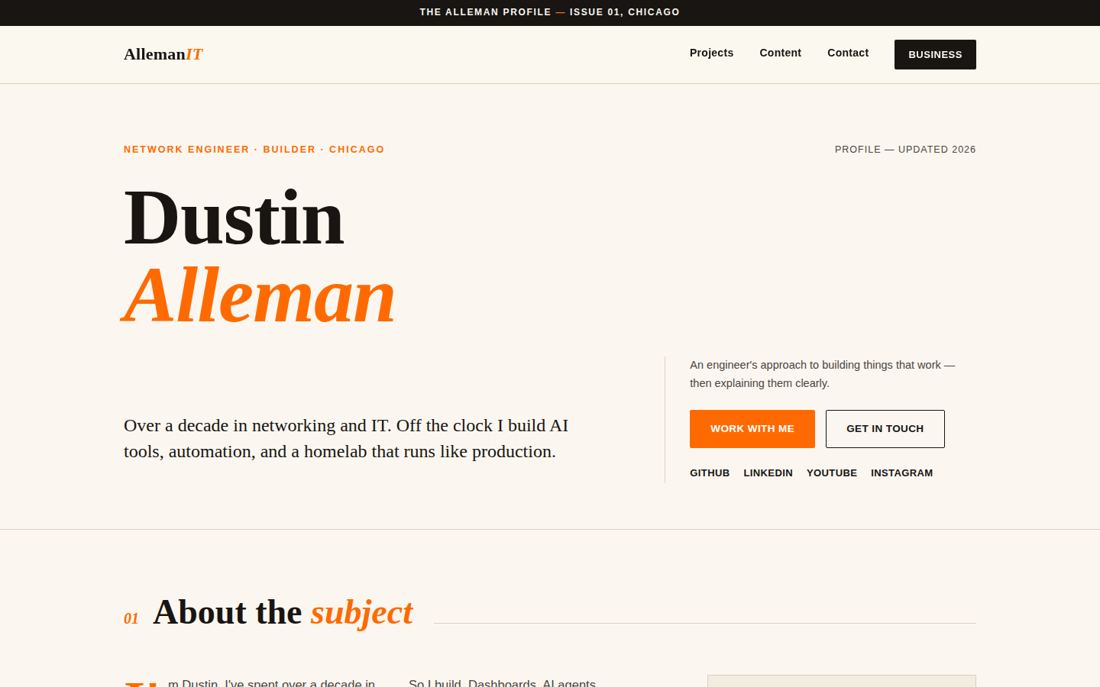
Editorial and personal. Reads like the Daily page. Too quiet for a sales site.
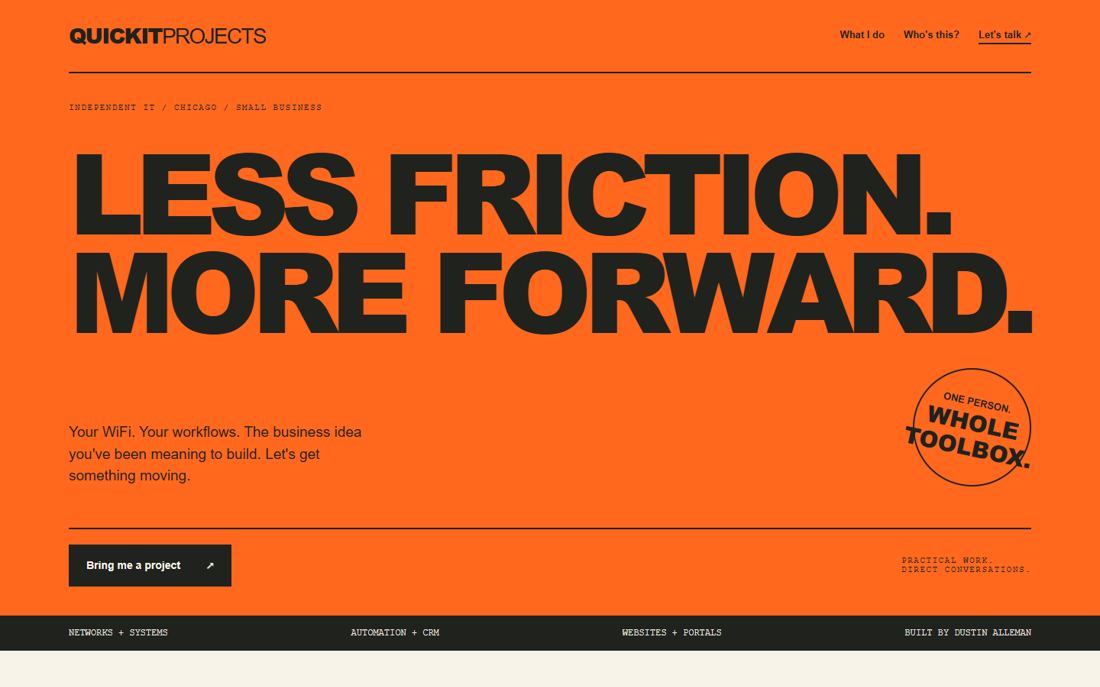
The orange personality I liked, borrowed into the winner as the action labels.
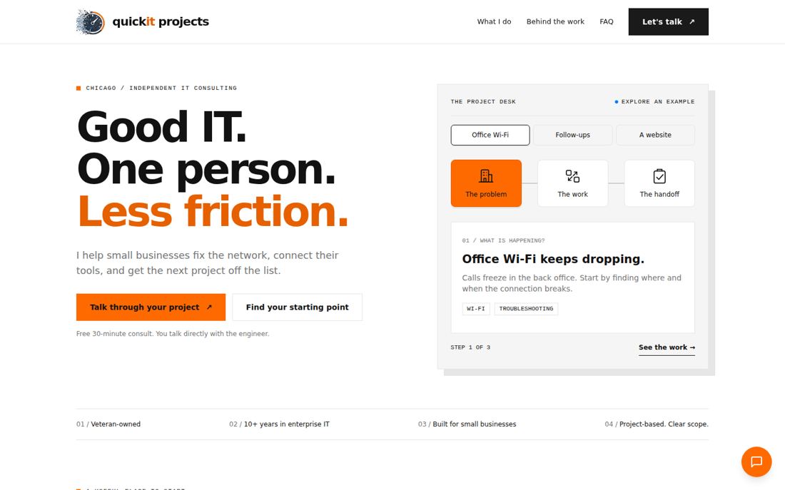
Concept 01 plus 04's labels, the real speedometer mark, an interactive project desk, and an inquiry demo that is labeled as a demo.
This site, four ways
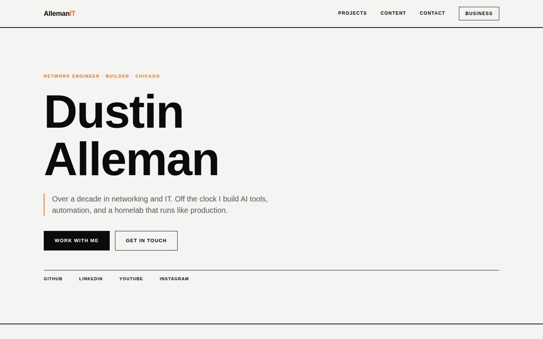
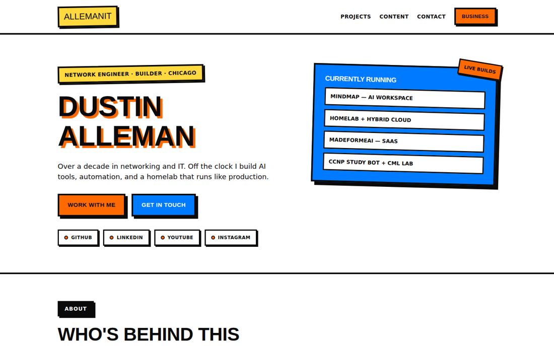
Before allemanit.com looked like this, it looked like these. Each one is still a real page you can open.
See the output
Every site this process produced.